OPen

Archives(10+)

Welcome to my archives! This collection features creative experiments, one-off projects, and early professional work that shaped my design journey. While not every piece includes a full case study, this space highlights my evolution as a designer over the past eight years through exploration, learning, and growth.

I enhanced Discover’s credit card and debit landing pages by refining existing layouts and modules already coded by developers. My role focused on elevating the visual design—improving hierarchy, selecting engaging imagery, and polishing details to make the pages more visually appealing and user-friendly. These updates gave the pages a refreshed look while staying true to the brand’s identity and ensuring a cohesive, modern experience for users.
I art directed, designed, and produced this winning 2025 GDUSA In-House Design Award. This campaign showcased Discover’s 99% nationwide acceptance with bold placements at the Big Ten Football Championship, including the iconic Indianapolis Artsgarden. The creative message, “No matter which jersey you’re wearing,” celebrated fan pride while driving strong brand visibility.
I designed a playful series of stickers for Discover by transforming the brand’s signature glowing ‘O’ into fun, character-driven illustrations. I also created a second set tailored to a few internal departments. Both collections were designed to infuse personality and positivity into the brand, while keeping the visuals lighthearted and engaging.
I designed a series of in-app ads for the Uber app, ensuring the creative stayed on brand while meeting precise file size and format requirements. Each ad featured carefully selected lifestyle imagery to clearly communicate Discover’s message in an engaging and user-friendly way.
The goal of this project was to provide moral support and diversion to those in our community who were strongly impacted by the pandemic by offering them the chance to learn to play the ukulele. We aimed to help individuals whose mental health had been affected by prolonged lockdown measures and who otherwise wouldn’t have been able to afford an instrument. I led all the graphic design for the social media campaign and donation page, creating engaging visuals that drove awareness and support for the initiative.
As part of my Springboard UX/UI program, I partnered with a real client to redesign their law firm’s website. I improved the site’s navigation, accessibility, and overall look, creating a modern, professional, and user-friendly experience across desktop and mobile.
I created a bold and professional brand identity for Kodiak Construction, featuring a strong bear emblem to represent reliability and strength. The design was applied across business cards, promotional stickers, and custom patches for their workwear, ensuring a cohesive and impactful brand presence.
I created a series of hand-crafted illustrations for Subway Canada’s Never Miss Lunch™ campaign in partnership with Food Banks Canada. Using a laser cutting machine, I printed and assembled layered paper designs that were later brought to life through stop-motion animation.
A collection of event posters I designed for a local Irish pub, promoting themed nights and special gatherings including game nights, holiday parties, and live music.
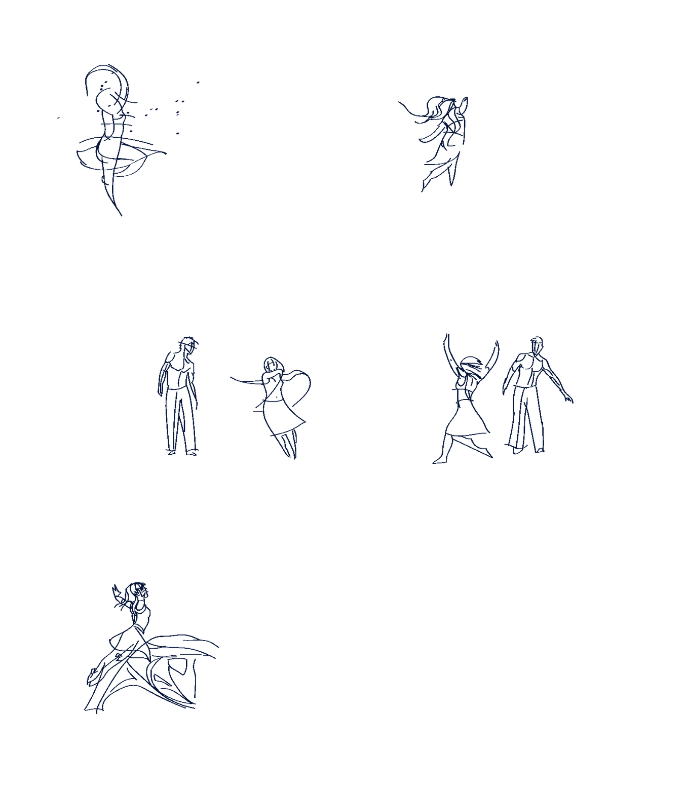
This hand-drawn animation was created frame by frame, inspired by a real video of two people dancing. I illustrated each movement to capture the fluidity and emotion of the dance, transforming it into a series of expressive line illustrations that bring the choreography to life.
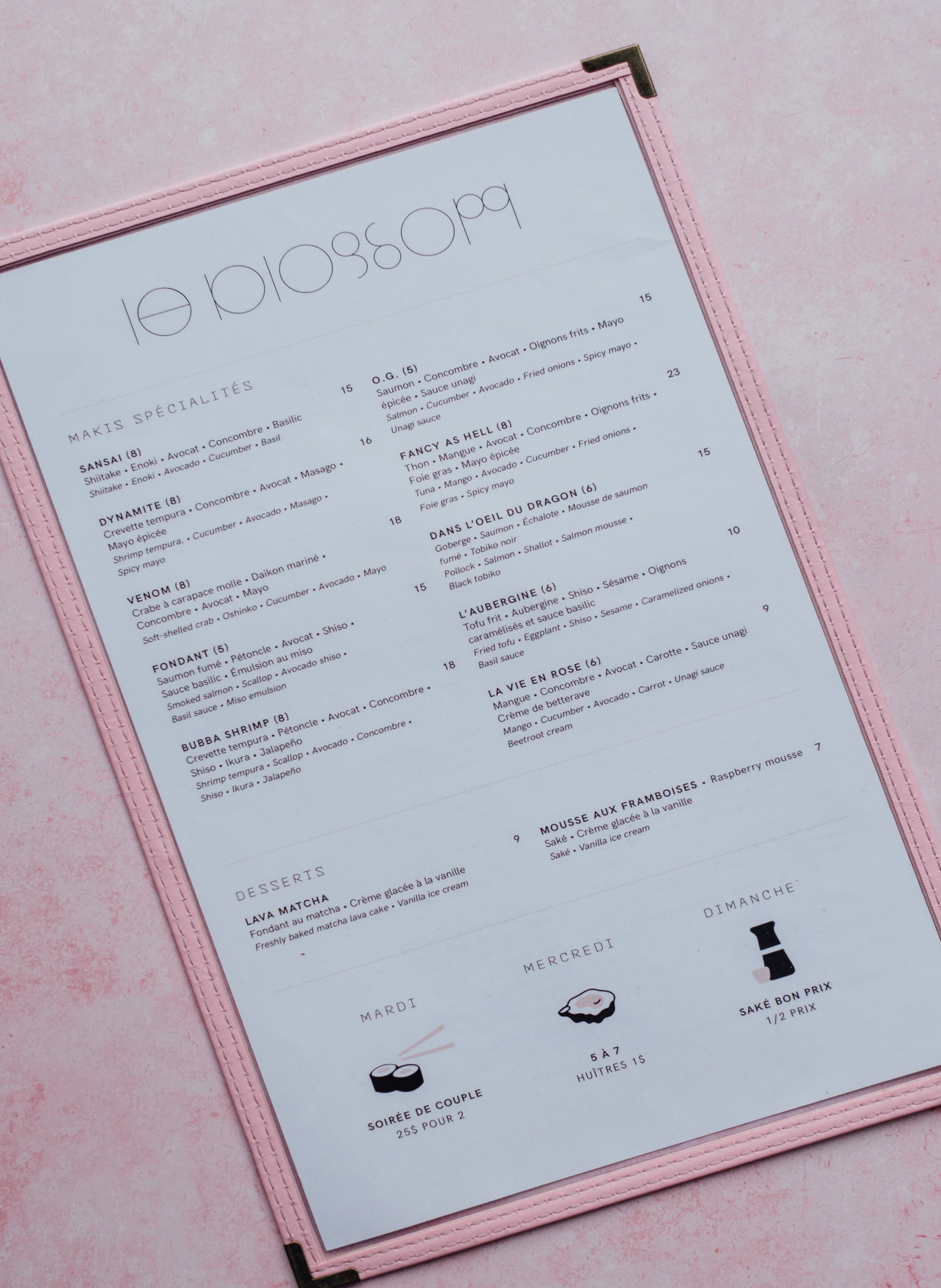
I designed this menu for a Japanese sushi and sake restaurant, blending elegance with functionality. The layout highlights specialty makis, desserts, and a carefully curated sake and wine list. To enhance the dining experience, I created custom icons and a unique color-coded system, making it easy for guests to identify the flavor profiles and types of sake at a glance. The design pairs minimalist typography with soft pastel tones, reflecting the refined and inviting atmosphere of the restaurant.
This digital collage series was created using hand-cut textures in Photoshop, transforming photos of friends’ and family’s children into playful, colorful illustrations. Each piece captures the joy and creativity of childhood in a modern, and represents activities children would do during the pandemic.
I designed this tour poster for Kandle, created with digital collage. On here is a combination of bold photography and graphic flame elements through digital collage, to highlight tour dates and capture the energy of the shows.
A clean, modern PDF brochure designed for a web design company to showcase Molsoft Support Services, featuring custom illustrations, bold typography, and a clear layout for easy navigation.
FERRO Poisson & Fruits de Mer delivers fresh seafood straight to your door, complete with chef-curated recipe cards. These modern, easy-to-follow designs elevate the at-home dining experience with a premium, restaurant-quality touch.